The modern world is colourful. Emails and websites used to be plain and simple text, void of colour and imagery. Now brand colours are infiltrating our screens all day, every day, and some colours can even signify an entire pre-defined set of rules – red means cancel, green means go. But how does this affect the way we view websites and brands? Can this be used to your advantage? Before we answer those questions, we need to speak the same language as designers, to get the right colours for your brand.

Decoding Colour
First off let’s translate colour into something more scientific. When speaking to a designer or a developer they don’t see colours as simple as “Blue” or “Green” – to them blue means one of 10,000 different colours!
Let talk their language:
- Hue – This is the broadest term that you can use this is what we start with. Saying blue here give us the narrow band of how we get the right blue for you.
- Saturation – This is how strong the colour comes across, how much blue in your mix.
- Brightness – This affects how much light is behind the colour.
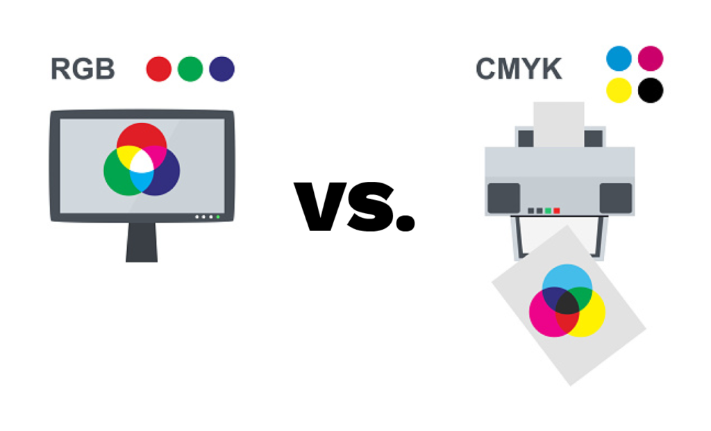
- RGB – Red, Green, Blue. You can mix these prime colours to make you special blue colour on a screen. Black and white don’t exist (Technically) on screens, black is the absence of light, and white is all light. As you always have a backlight on most screens there no true black.
- CMYK- This is what is used in printing and stands for Cyan, Magenta, Yellow and Black (K). Mixing these on paper creates colour, technically there is no white in this model as this comes from the background itself, i.e the paper.
- Hex Code – This is a code given to a colour for use online. It can reference an RGB, a CMYK and a HSB colour scheme.

Why Have I got Three different ways of using my brand colour?
A designer will create your logo, brand or website colour scheme and will more than likely provide you with three references, the RGB, the CMYK and the hex code. With these you can use your colours across all mediums. Sometimes designers will give you a different RGB and CMYK colour that each have unique hex codes – why is this?
Wellm, the reason goes back to the technicality of white and black. Screens are always backlit, they always shine pure light out of the screen and the pixels adjust to present the colour requested. As such black is almost impossible to create. Try it yourself, get something on the screen that’s pure black, and in real life get something that is real black. Your screen will be a subtle grey. (Ok so you’ve done this and there’s no difference, you’ve either got a fancy screen or your backlight isn’t truly a back light. We are speaking ‘generally’)
So, that makes sense for screens, but what about print? Well it’s the virtue of white in this case. Print assumes that white comes from the paper. In most cases that’s great, but some paper isn’t pure white. Sometimes (like newspapers) it’s a subtle yellow or beige, sometimes it’s white with a blue tinge. In those cases, you might be given a different calibration of CMYK to get your colour for that type of paper. (it’s worth adding a side note here. While you can technically print white, for example in silk screen printing, it’s not used in offset printing. No domestic printer has white as an ink. )

So now I can speak colour, but how do I use it?
We’ve covered the basics of how to speak colour and now we can move on to how colour can be used to our advantage. Colour schemes can be built to make your brand match or contrast your landscape, and they can how be used to evoke a response.
If you’re reading this and thinking I need more colour in my brand, or maybe you’ve read this and every time you go to print, your colour just isn’t right? FreshStart are here to fix that. Get in touch with us and we can review your brand and make it stand out. Have a brochure you need sorting? We can do that! Send the brief to us and we will make sure it’s designed beautifully to meet your needs!


